Overview
Quickly understand the recorded data through custom charts
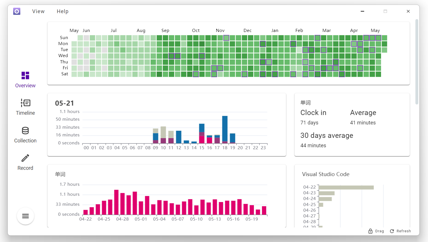
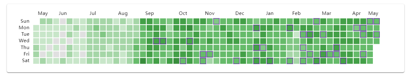
Active Status Calendar
Use github-style charts to record the total time spent on specific projects every day, and the depth of the color represents the duration
The purple border indicates that there is note data for that day, which has been taken over by the extension obsidian
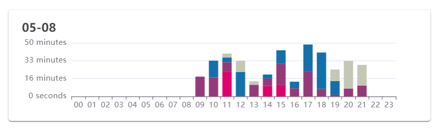
Daily Activity
24-hour activity chart, recorded in segments for each hour. By clicking on any date in the Activity Status Calendar, you can view the data in a linked manner
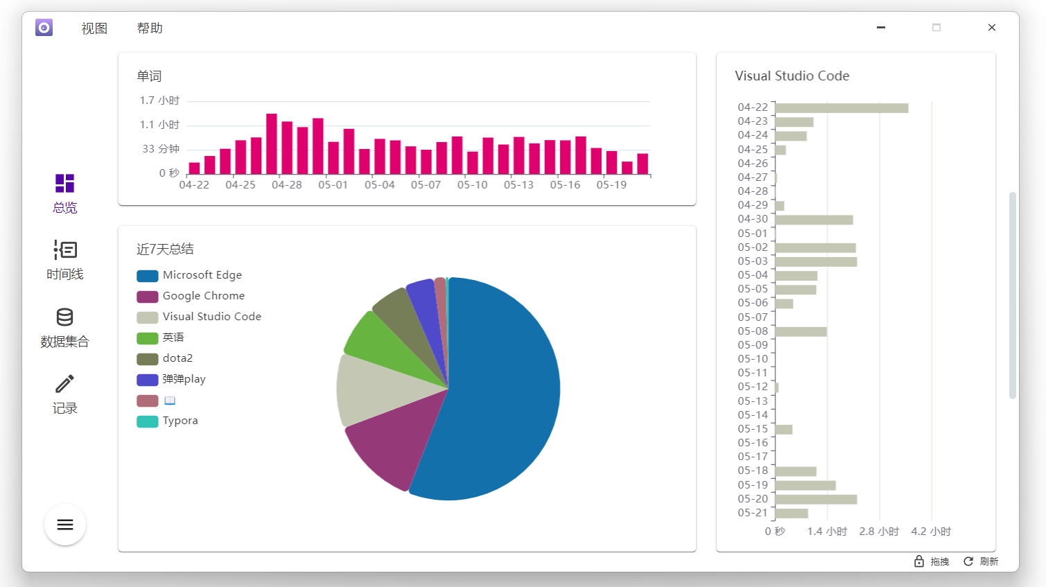
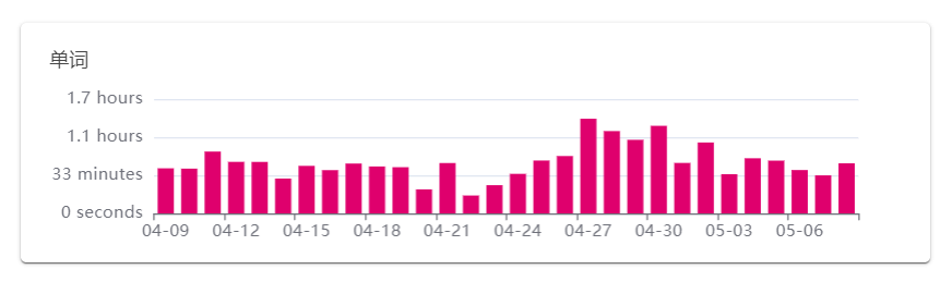
Single Category Bar Chart
A chart showing the data set of manual timing and automatic timing for the past 30 days
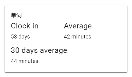
Text Summary
Same as single category bar chart, but displays data in text form
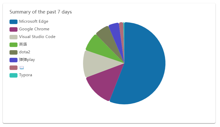
Recent activity pie chart
Charts showing the summary of the data collection of manual timing and automatic timing in recent days (when there are too many types of data, only the first 12 items legend will be displayed)